MY BOOK COVER! (and it's evolution)
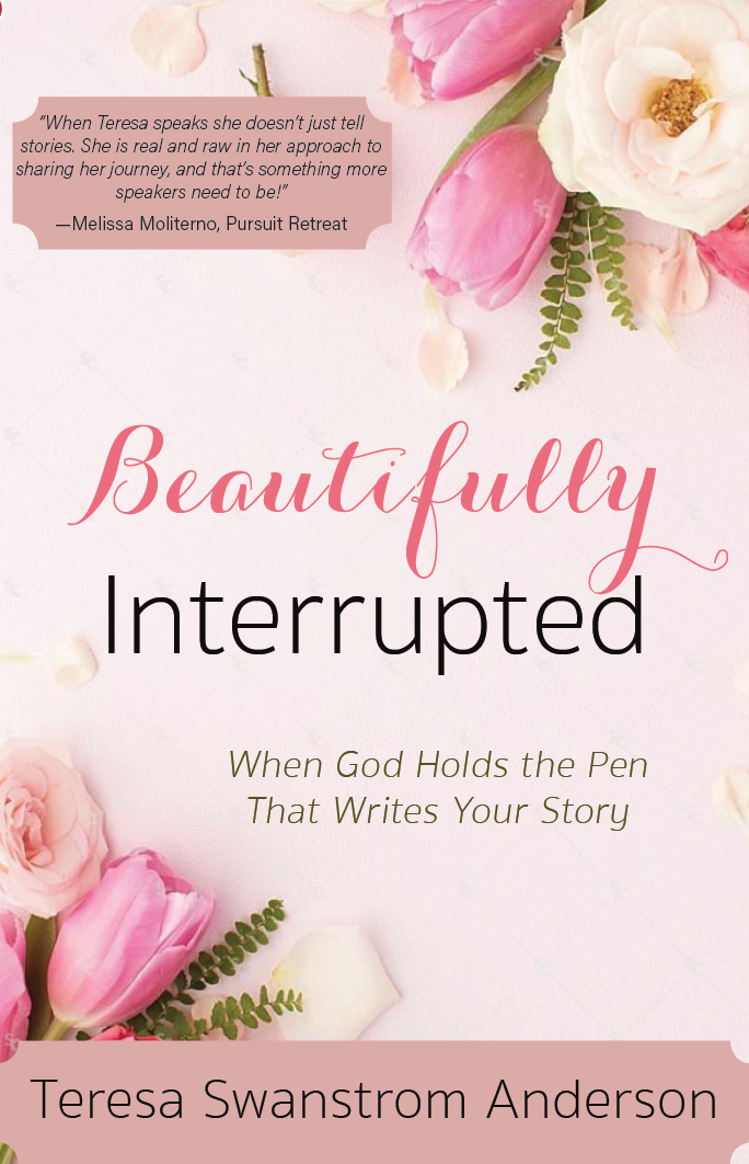
Guess what....I'm revealing my book cover today!! Major happy dance going on over here. With everything that's been going on lately, it's such a fun ray of sunshine!
Ok, you ready for it? I've been aching to show you!! But first...
Want to know it's evolution??
Cuz this was definitely not a first draft decision, haha. (I was SO afraid they thought I was an annoying, overly-opinionated author. They assured me this was totally normal. Phew!!)
Cover #1
So cover number one was just not my favorite. It just didn't feel like "me". I love rustic...but it's not really my branding. I wanted somthing that POPPED off the shelf!
Cover #2
This second cover is definitely more colorful and bright (which I love) but...I don't know...it just still didn't feel right. I liked the watercolor...but I just didn't feel like this was "it".
Cover #3
These third and fourth covers were definitely just mock-ups. We were just playing around with the use of the gorgeous photos by my friend Shay over at SC Stockshop. The fonts and stuff were just stand-ins while we played around.
I liked it...but the colors were still a little soft.
Cover #4
Just like the cover up above, this fourth one was just us playing around, trying to get the "feel" of what I was envisioning.
Cover #5
Now we're getting somewhere!! I am in absolute LOOOOOVE with this one! I asked my friend Jordanne to do the hand-lettering and gosh...doesn't it just pop?! But ultimately, we couldn't afford the rights to the gorgeous photo.
Back to square one!
Cover #6
So, Jeff...my sweet graphic designer over at Worthy, knew how much I loved that fifth cover design and tried to find something comparable.
We needed to decide THAT DAY because my Advanced Readers Copy had to be ordered by the end of business day. An Advanced Readers Copy (or ARC) is sent to magazines, radio, television, podcasters, and bloggers who we know have a long lead time. In other words, if my book is out in May...they need to read it now so I could get on their schedule.
I'm gonna be honest...I just didn't like it. At all.
BUT since we had to order the ARCs that day, this is the cover they have (tear). But that's ok...because my FINAL cover is so gorgeous, it was worth the wait.
Cover #7 + #8
Ok so here are the final cover choices (ignore the watermarks). Can you figure out which one I chose????
As much as I loooooved the dark version, the light, bright, and happy one is the winner!
AAAAAAAHHHHHH! (can you sense my excitement?!)
I'm totally squealing and jumping up and down. Gah...it's everything I'd hoped it would be. It's bright, pretty yet not overdone, floral, pink...and well...just happy.
Note:
Since my ARCs were ordered with the cover that I really wasn't a fan of...this is how I'm sending them out. My best friend Kiesha had some postcards made (thanks, love!!) that fit perfectly over the book. Tying it up with a pretty velvet ribbon and the recipient will have the first impression of the cover!
Perfect in the meantime, right?? Lemonade out of lemons, people.
Want another sneak-peek?
We haven't finalized fonts for chapter headings and such, but below is one concept:
Don't you love that they're incorporating swans into the chapters? My logo is a swan and my maiden name is Swanstrom. It's really sweet and thoughtful of my editors to have come up with that idea!
I just adore it.
Since editing is basically done, most of my conversations are now with the marketing department.
One fun thing we're brainstorming about is what to include in the packages for my launch team and influencers....hmmm....ideas are flowing!!
What do you think?!
Do you like the one I ultimately chose??
Which is your favorite??
Take Joy,
Teresa
P.S. Also...in case you're curious, Beautifully Interrupted releases on May 15. That's two days before Mother's Day!
So if you preorder it...you'll be all set on your gift for mom! (Don't worry...I'll let you know when preorders begin. It's still a bit early for that.)


